Griddy Up
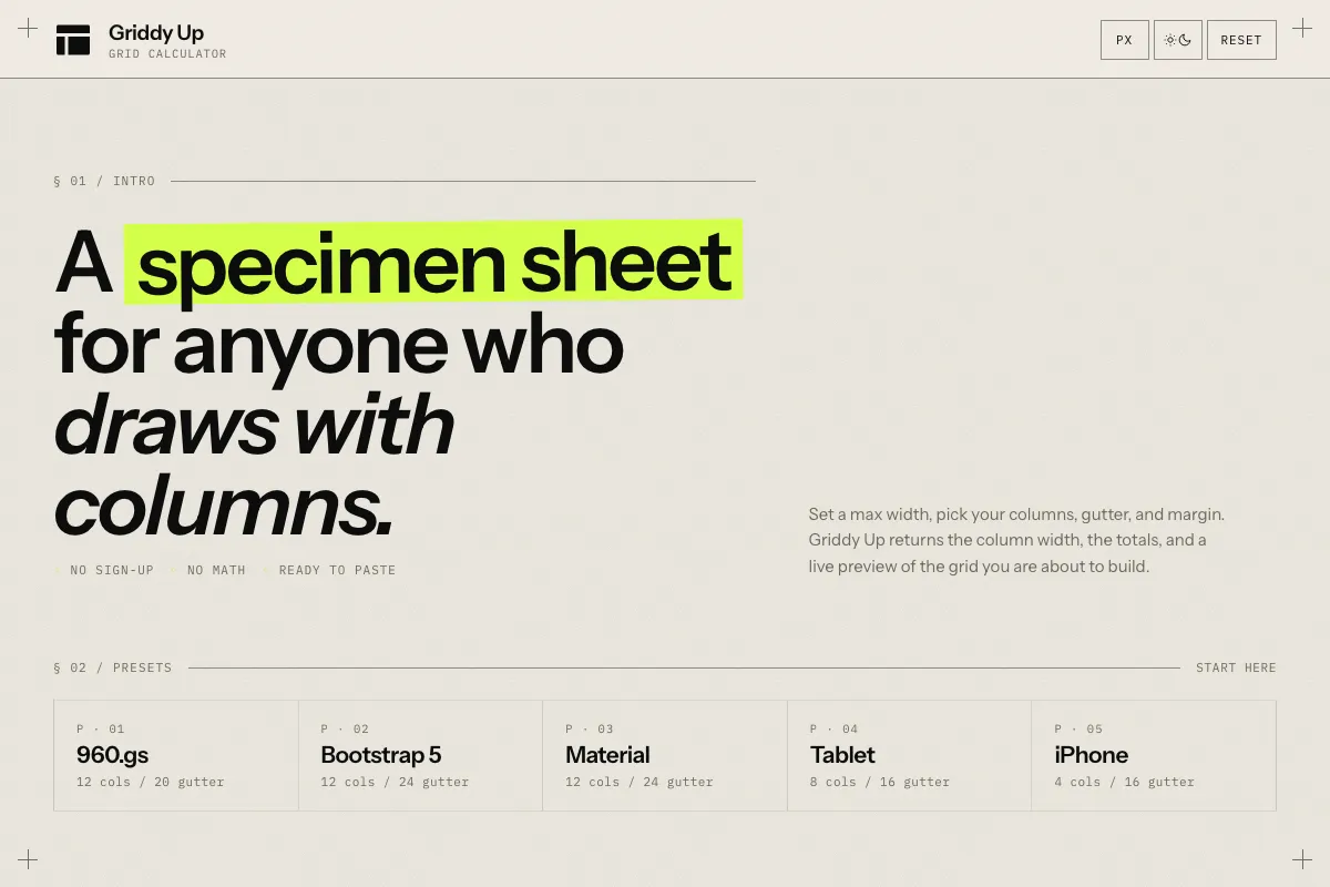
Griddy Up is a grid calculator for designers. Pick a max width, columns, gutter, and margin, and it computes the column width, renders the grid live, and hands back ready-to-paste CSS. No sign-up, no math.
What problem does it solve?
Designers reach for grids constantly, but the math behind them is fiddly. Subtract the margins, subtract the gutters, divide by the columns, and try to do it again when the brief changes. Griddy Up takes the four numbers you actually care about and gives back the column width, the totals, and a live preview, so you can spend the time on the design instead of the arithmetic.
How it works
Type the max width, the number of columns, the gutter, and the margin. The column width updates instantly. A scaled preview shows the columns, gutters, and margins in proportion. A CSS snippet at the bottom is ready to copy into a stylesheet. Presets cover the common starting points so you do not have to think from scratch.
Whom it’s for
Designers building layouts in Figma or the browser, developers checking that their CSS grid matches the design, and anyone who has ever opened a calculator app to figure out how wide a column should be.
Tech
Static single-page app in vanilla JavaScript with no build step and no framework. Set in Instrument Sans and IBM Plex Mono, dedicated to Wim Crouwel. Everything runs client-side. WCAG 2.1 AA compliant with full keyboard support, visible focus states, live regions, and reduced-motion handling.
Frequently asked questions
What is Griddy Up?
A grid calculator for designers. Set the container width, number of columns, gutter, and margin, and Griddy Up returns the column width plus a live preview of the grid.
What does it output?
Content width, column width, total gutter, and a copy-ready CSS snippet. There is also a live visual preview that scales to fit your screen.
Does it work in rem as well as px?
Yes. Toggle between px and rem at the top of the page. Rem values use a 16 px base.
Are there presets?
Yes. 960.gs, Bootstrap 5, Material, iPhone, and Tablet presets are one click away.
Is it free?
Yes. No sign-up, no ads.